The Pickle Pantry is an organic pickle brand centered around using simple and natural ingredients to create bold flavors. The branding reflects this through the use of soft, organic illustrations with vibrant colors.
Role: Branding, Logo Design, Illustration
Client: Personal Project
Logo Design
The bold and playful logo captures the spirit and values of The Pickle Pantry. Its rounded lettering echoes the organic curves of a pickled cucumber, while the strong, clear type ensures readability at any size.
Illustration Style
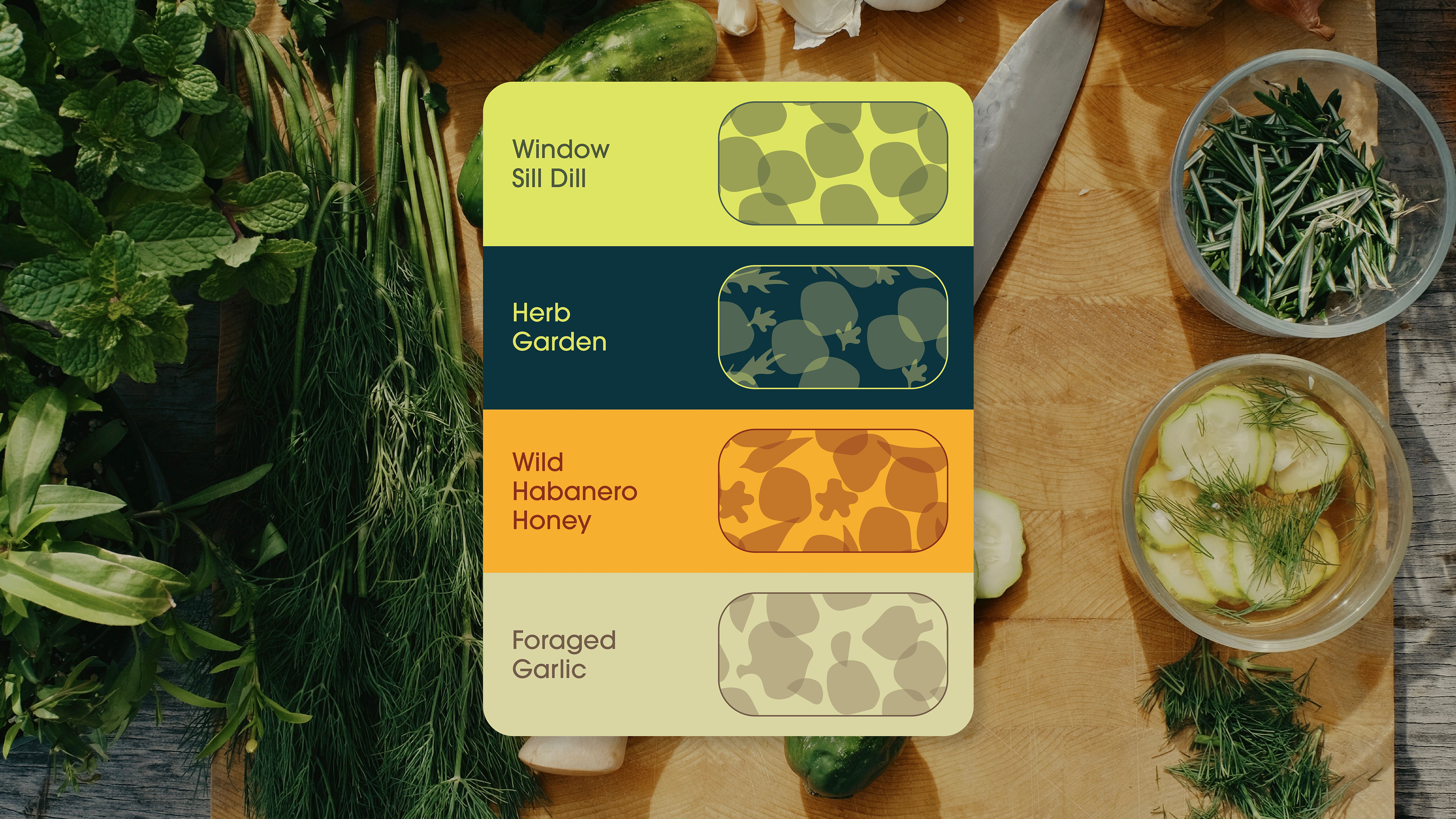
Featuring abstract, semi-transparent shapes inspired by natural ingredients, the illustration style enhances the brand’s playful tone while reinforcing its identity and appeal to consumers. The organic shapes evoke the natural ingredients found throughout the brand’s products.


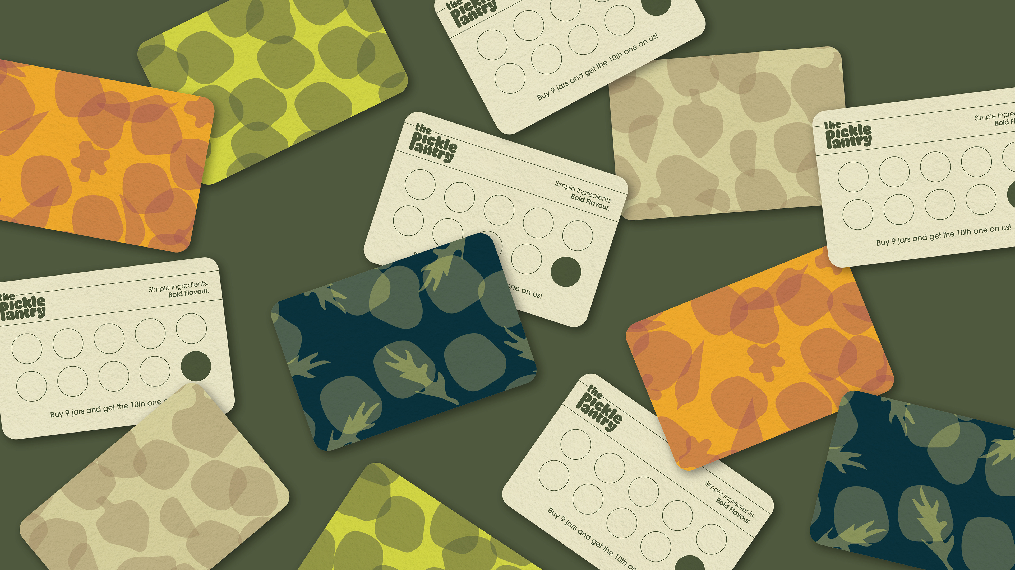
Punch Card Design
Packaging Design
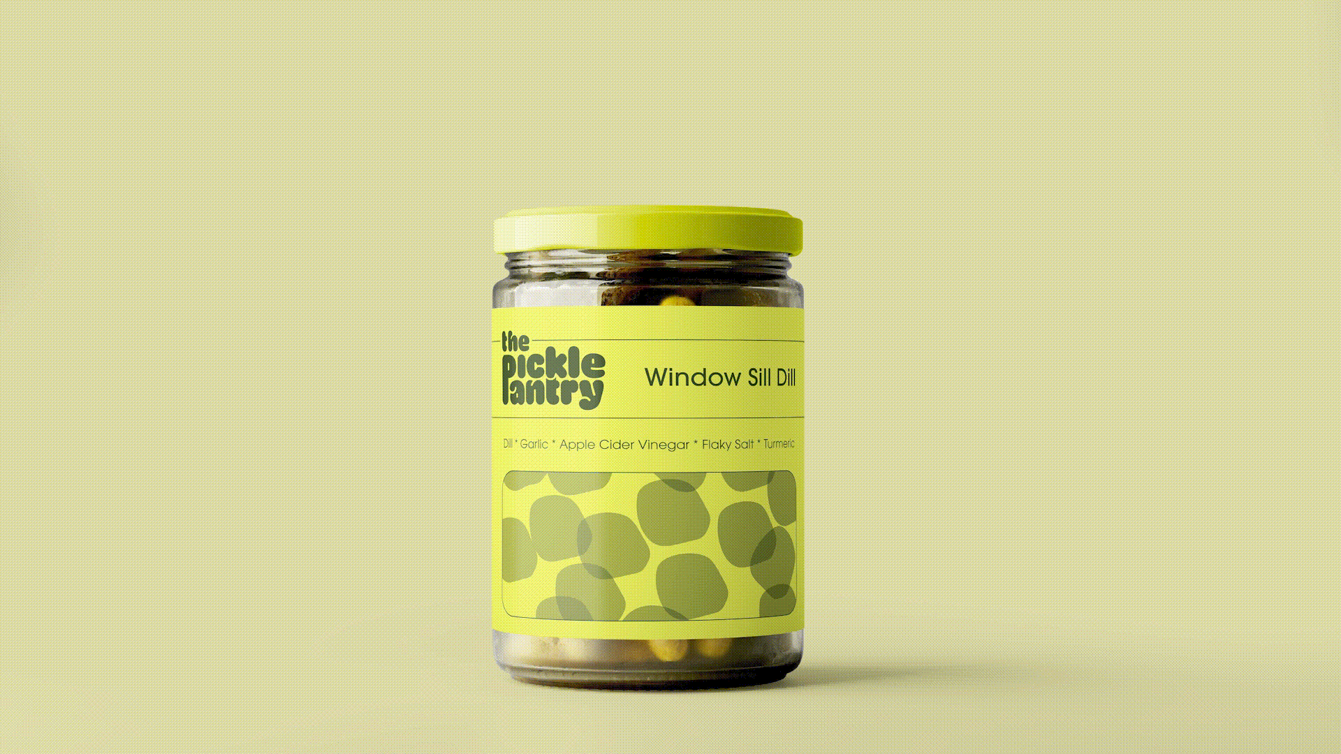
The packaging communicates the ingredients and experience of each of the four flavors developed for the brand, using the illustration as a "window" into the product.
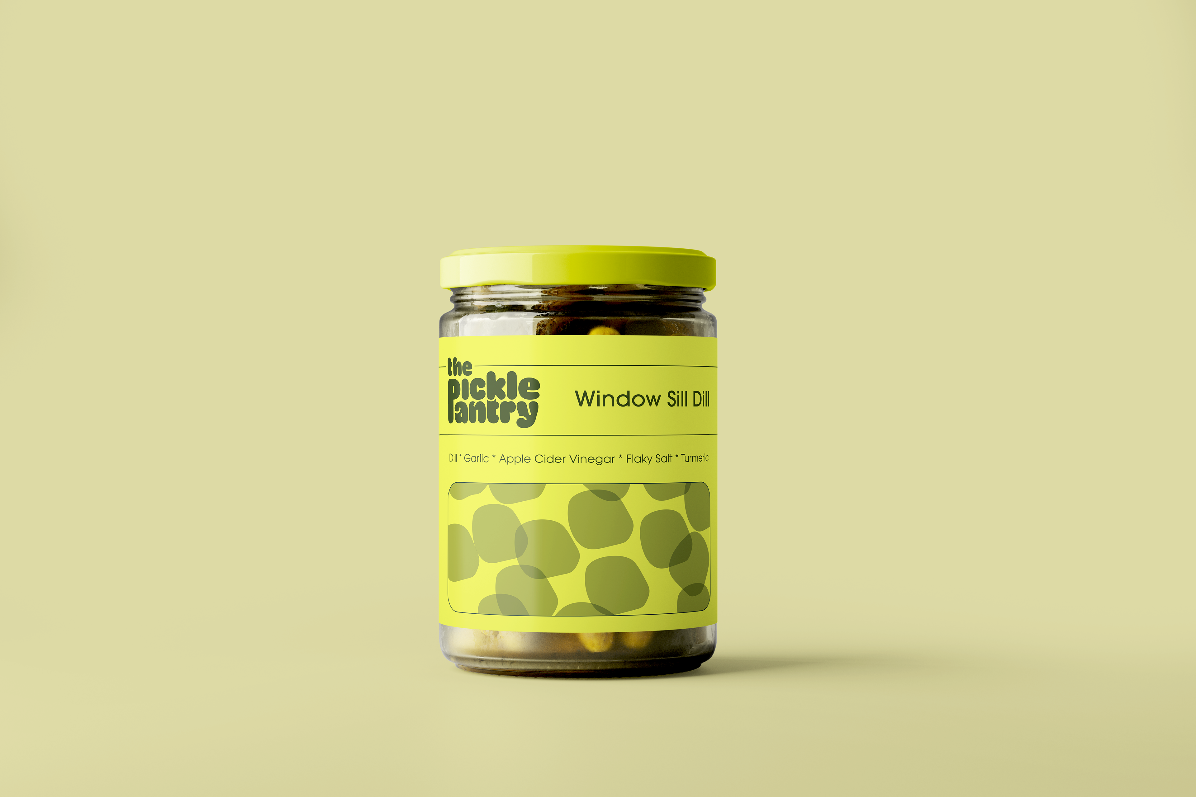
Window Sill Dill
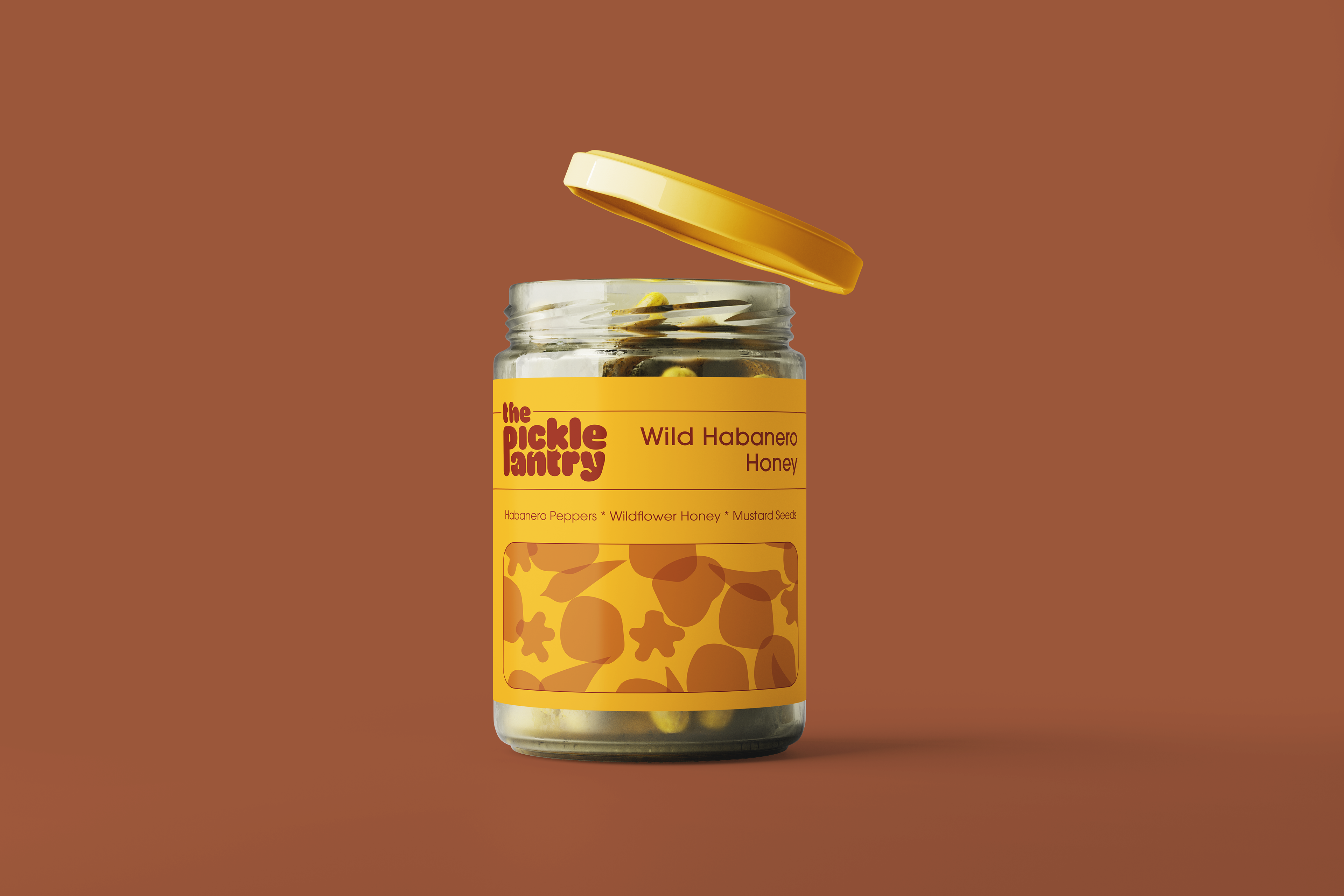
Wild Habanero Honey

Foraged Garlic
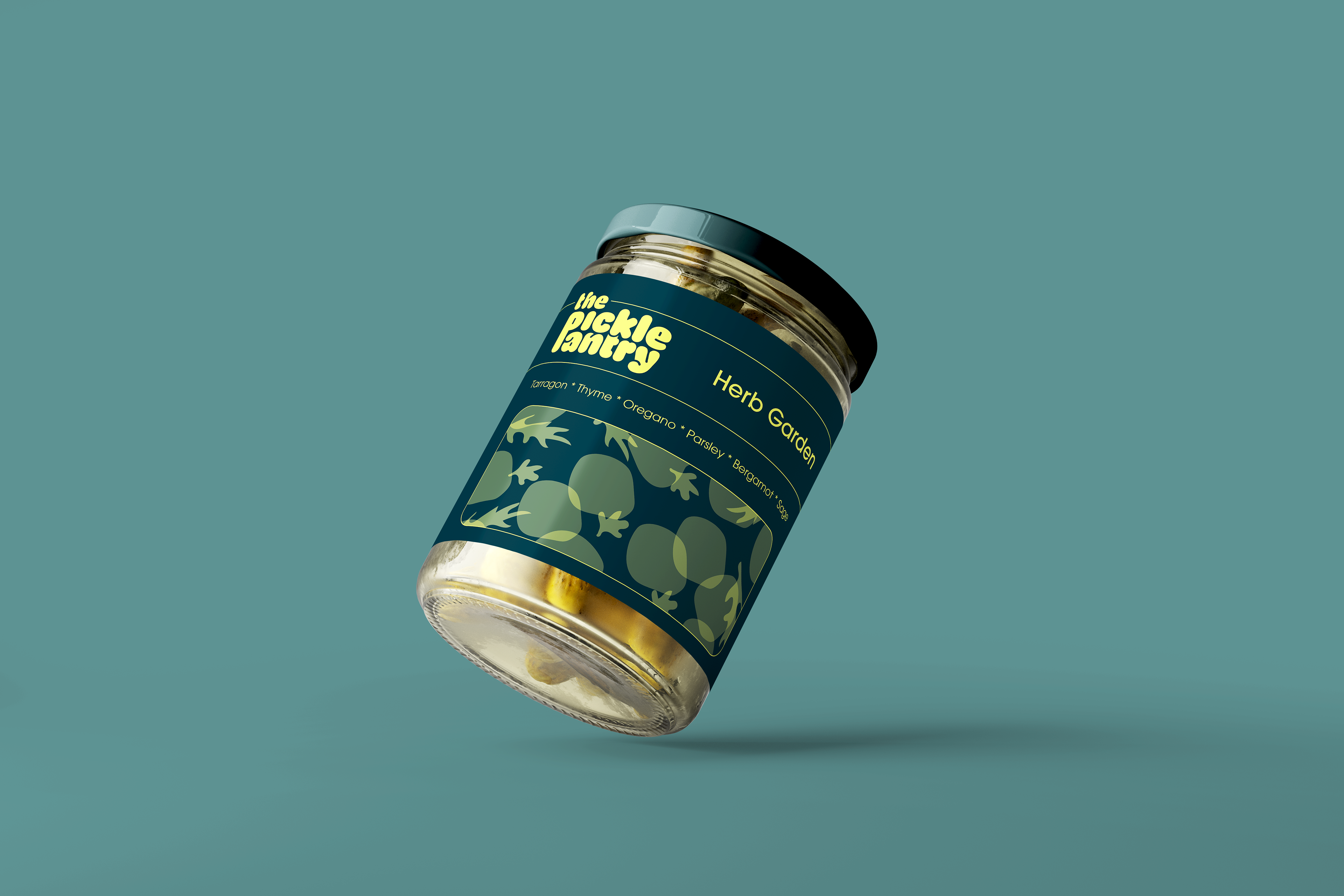
Herb Garden
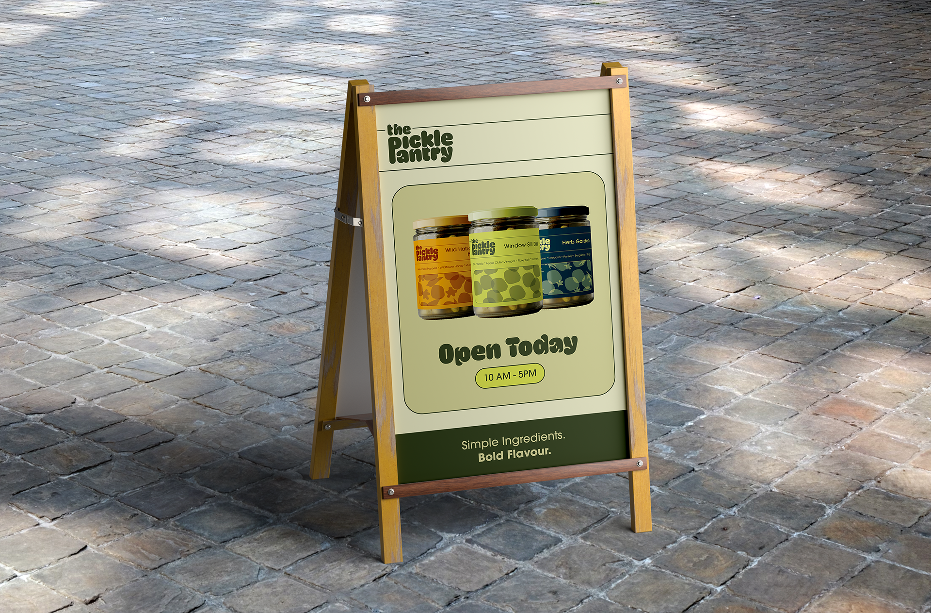
Signage
Featuring the brand’s typefaces, curved line elements, and product imagery, the print signage serves as a key marketing asset for The Pickle Pantry.