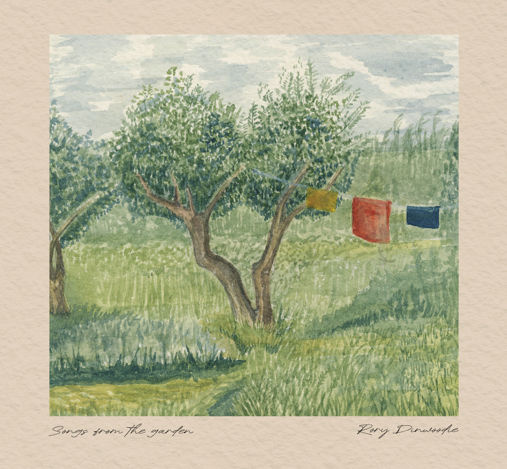
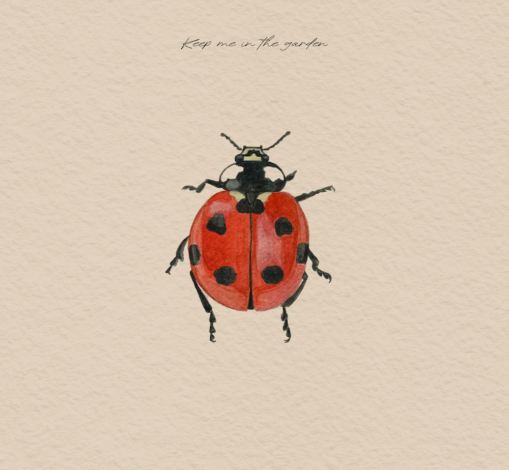
Combining original hand-painted watercolor illustrations with digital design, this project developed the visual identity for an indie folk EP exploring themes of memory, masculinity, nostalgia, love, and friendship. The final deliverables include the EP cover, five individual track covers, CD artwork, lyric cards, and promotional materials for both print and digital platforms.
Role: Visual Identity, Illustration, Design
Client: Rory Dinwoodie (Musician)
Process
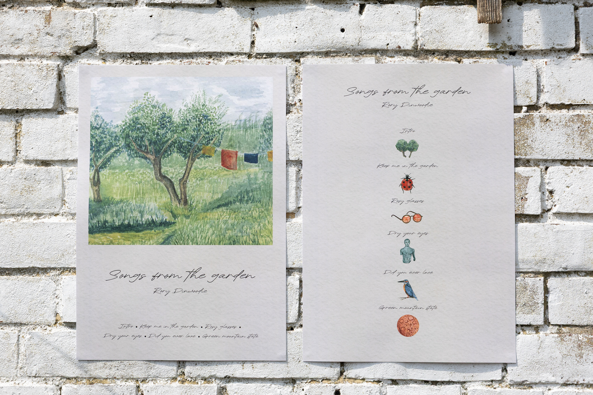
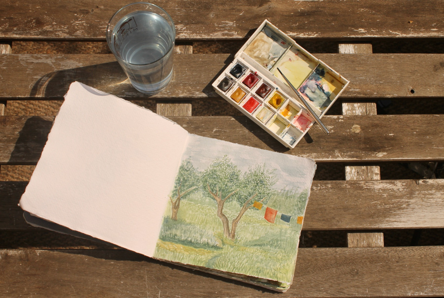
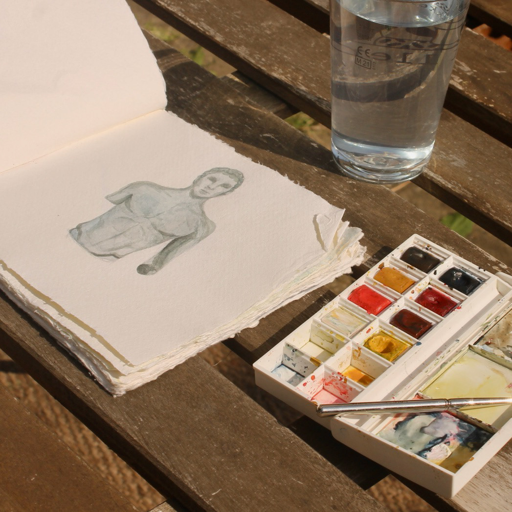
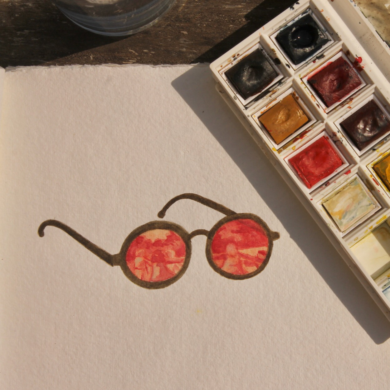
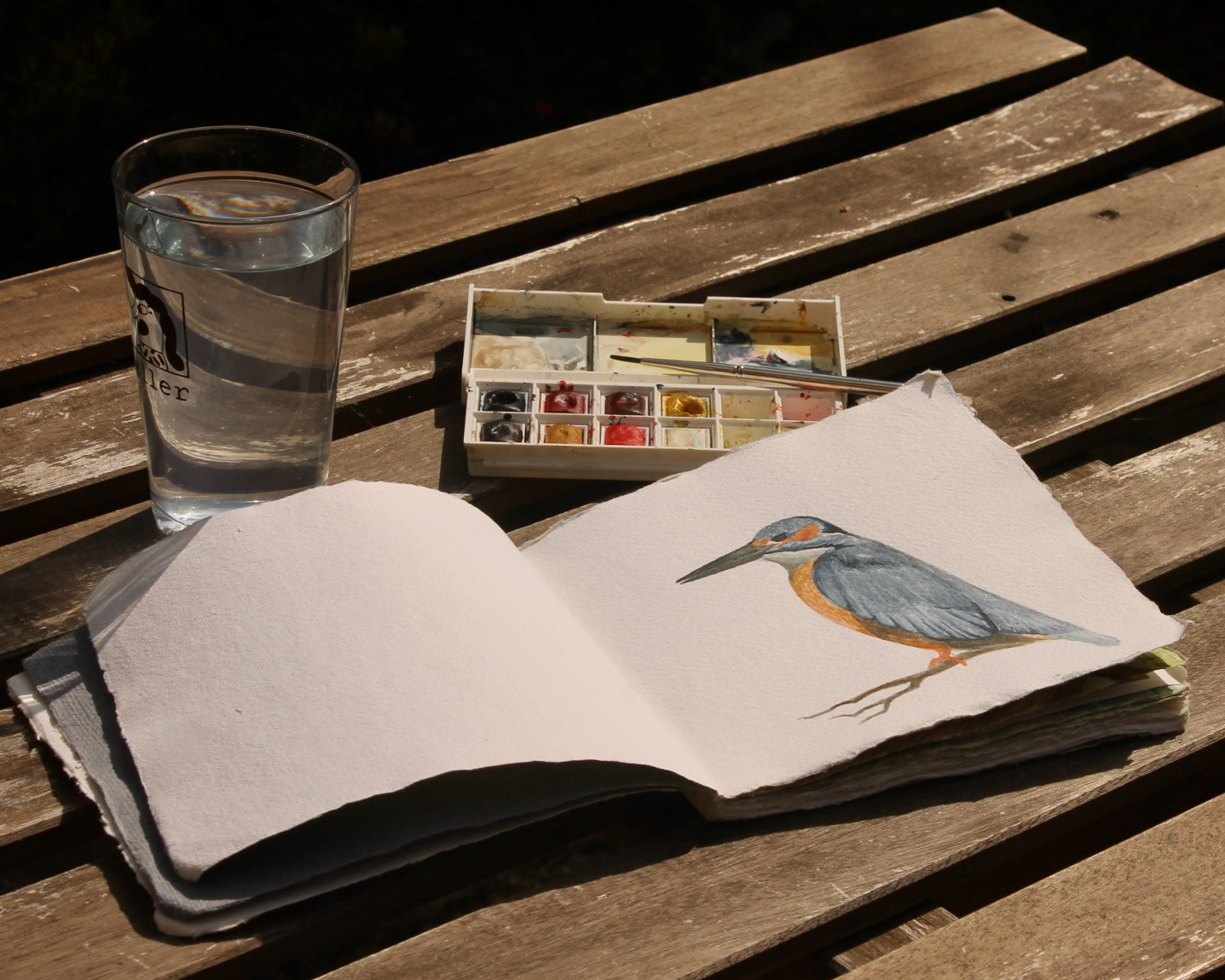
The visual identity began with a series of original watercolor paintings created directly in a sketchbook. Drawing inspiration from the themes of each song, the soft, illustrated quality of the artwork reflects the intimate, dreamlike feel of the music. Each painting was created as a standalone spot illustration, allowing the artwork to be refined, resized, and applied consistently across a range of digital and print formats while maintaining its handcrafted character.
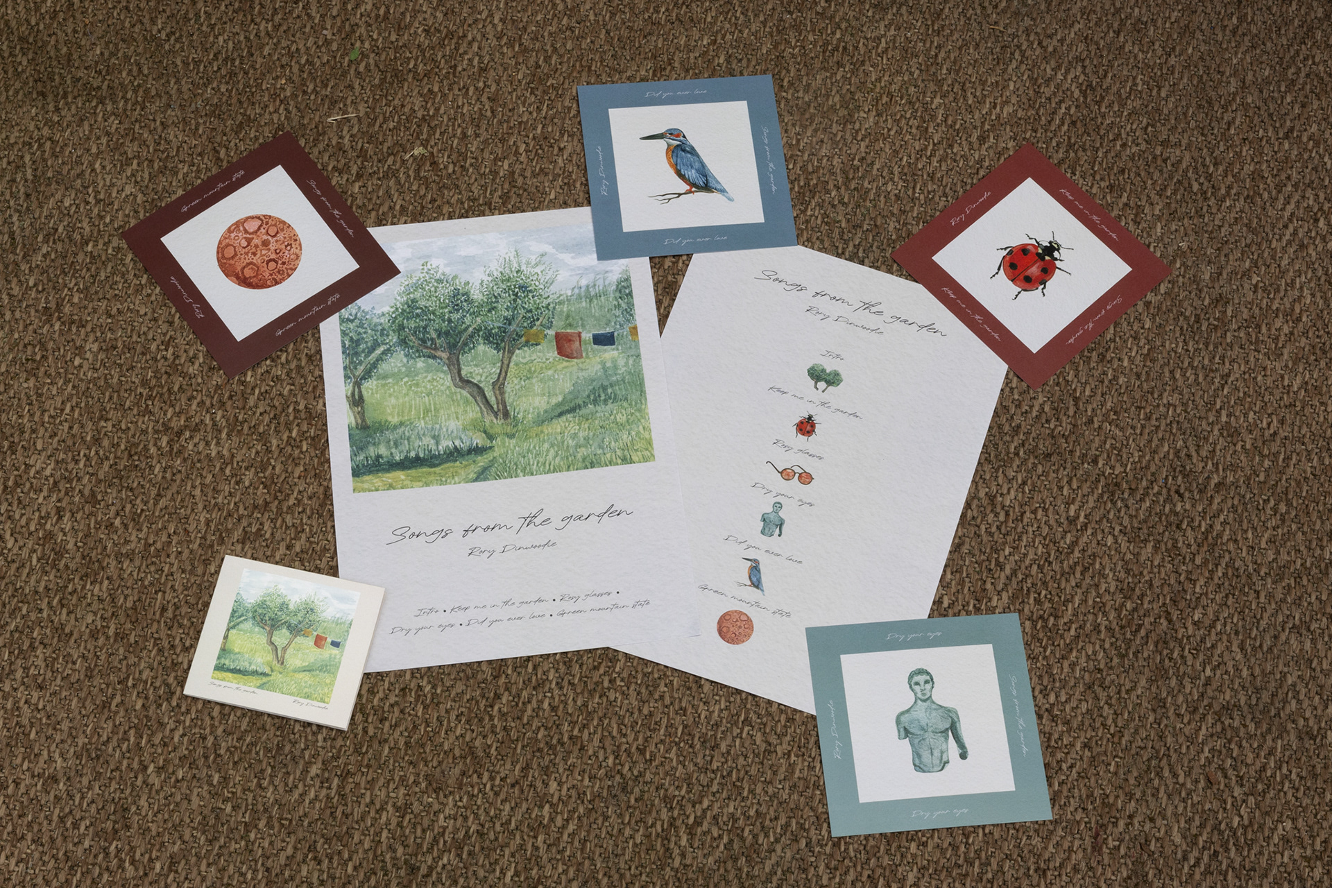
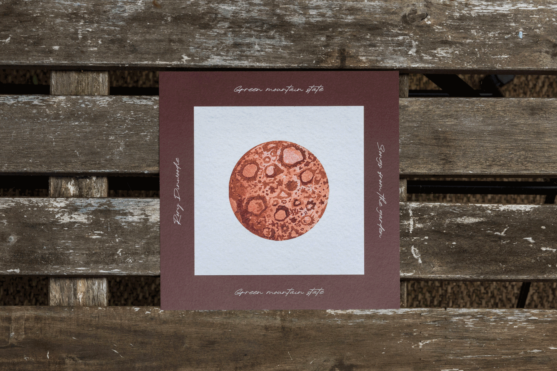
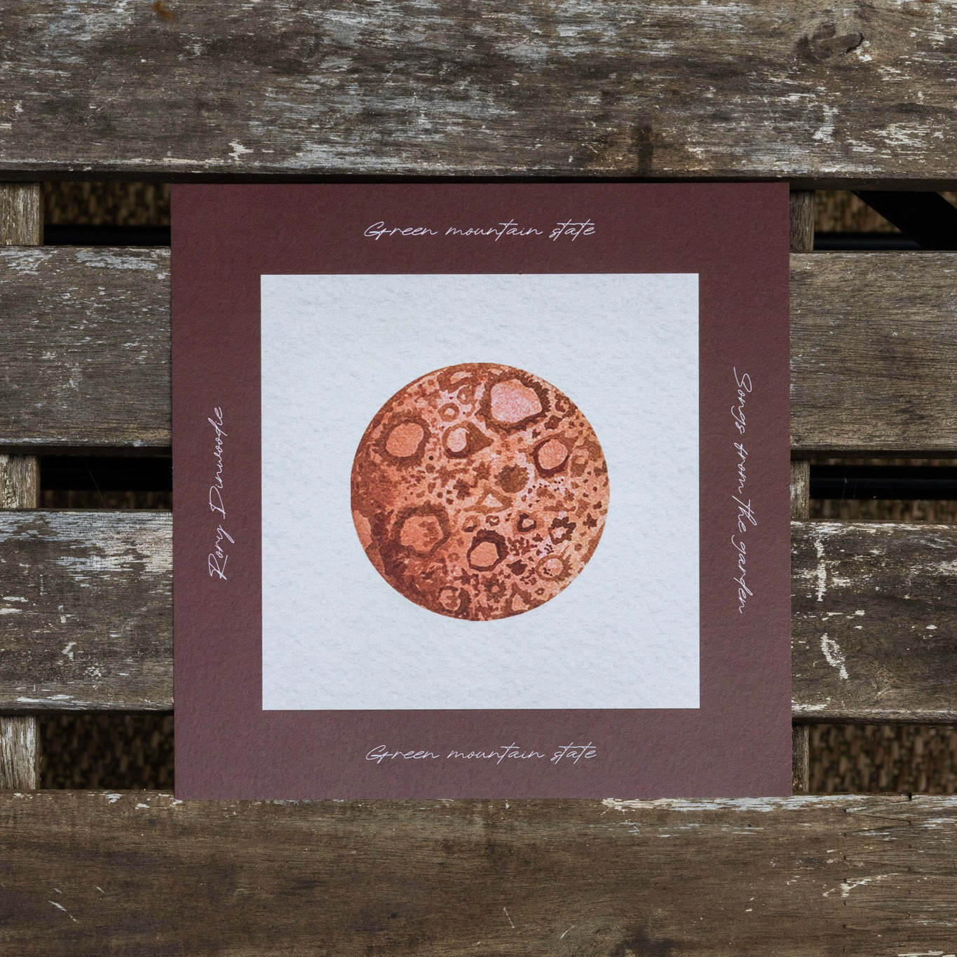
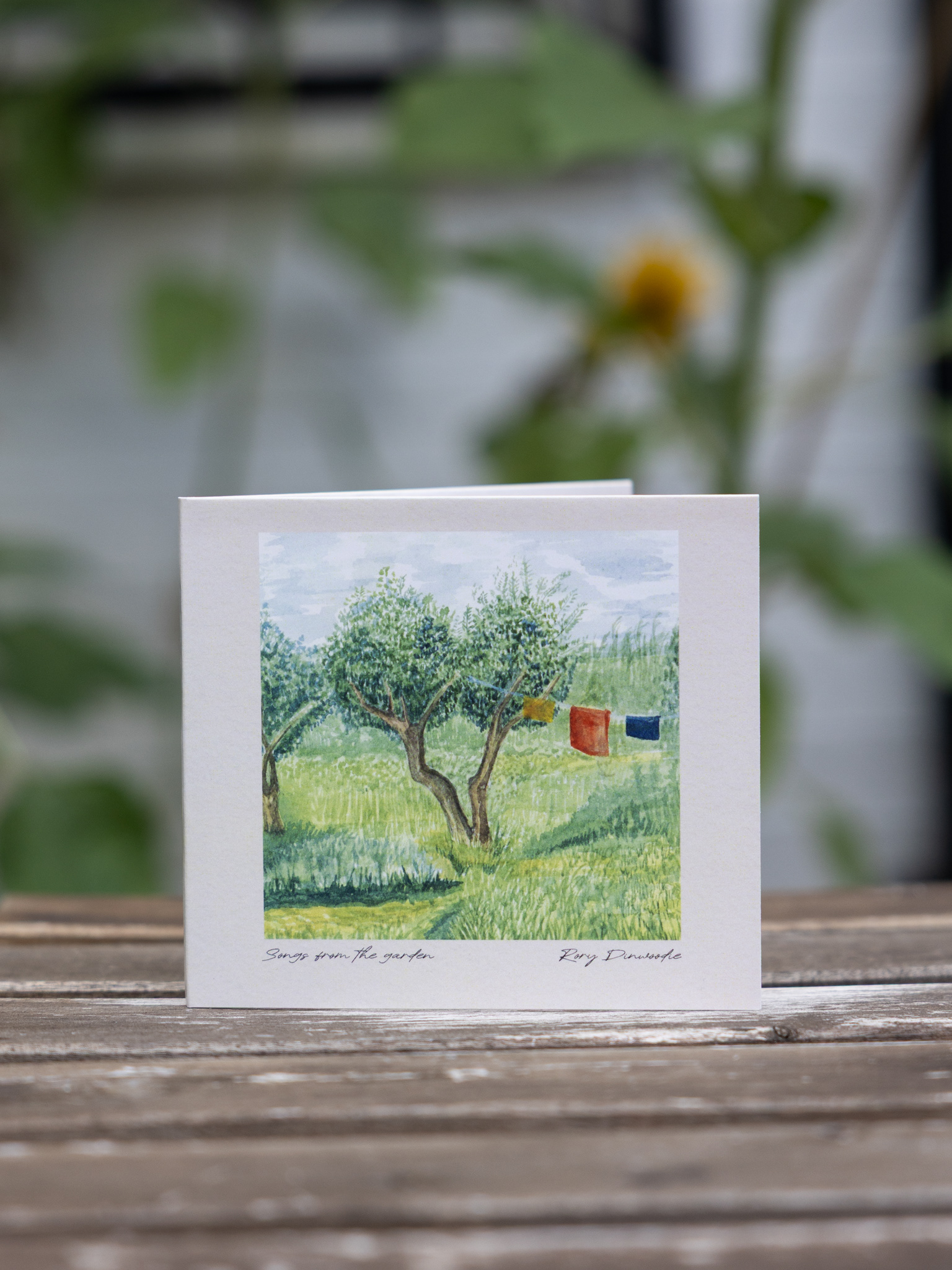
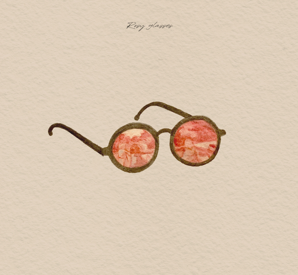
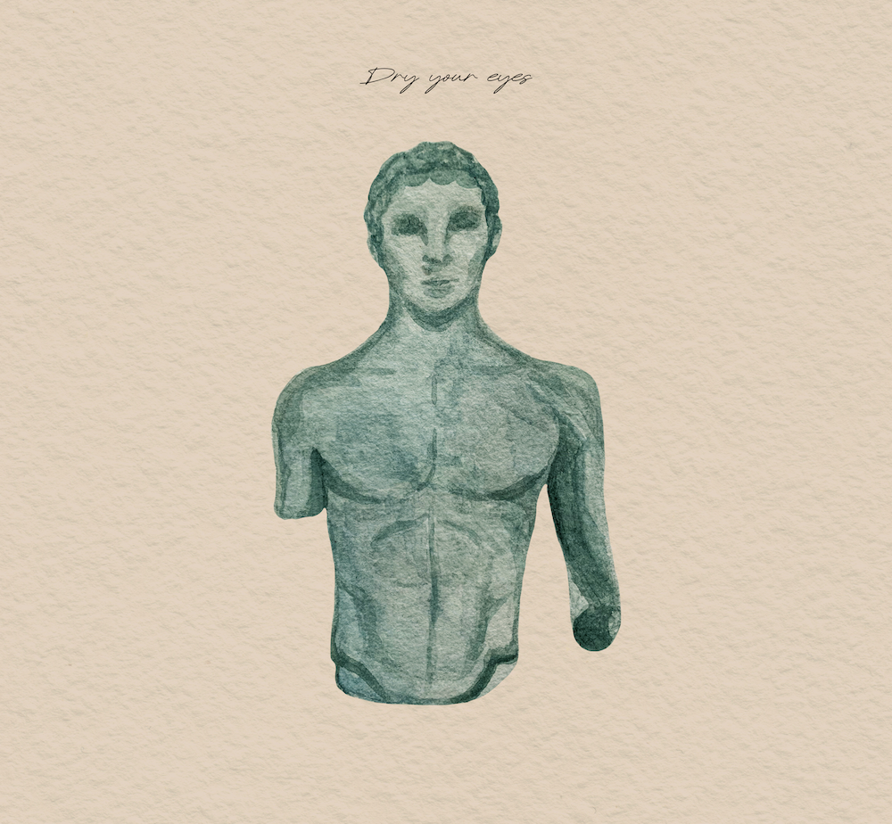
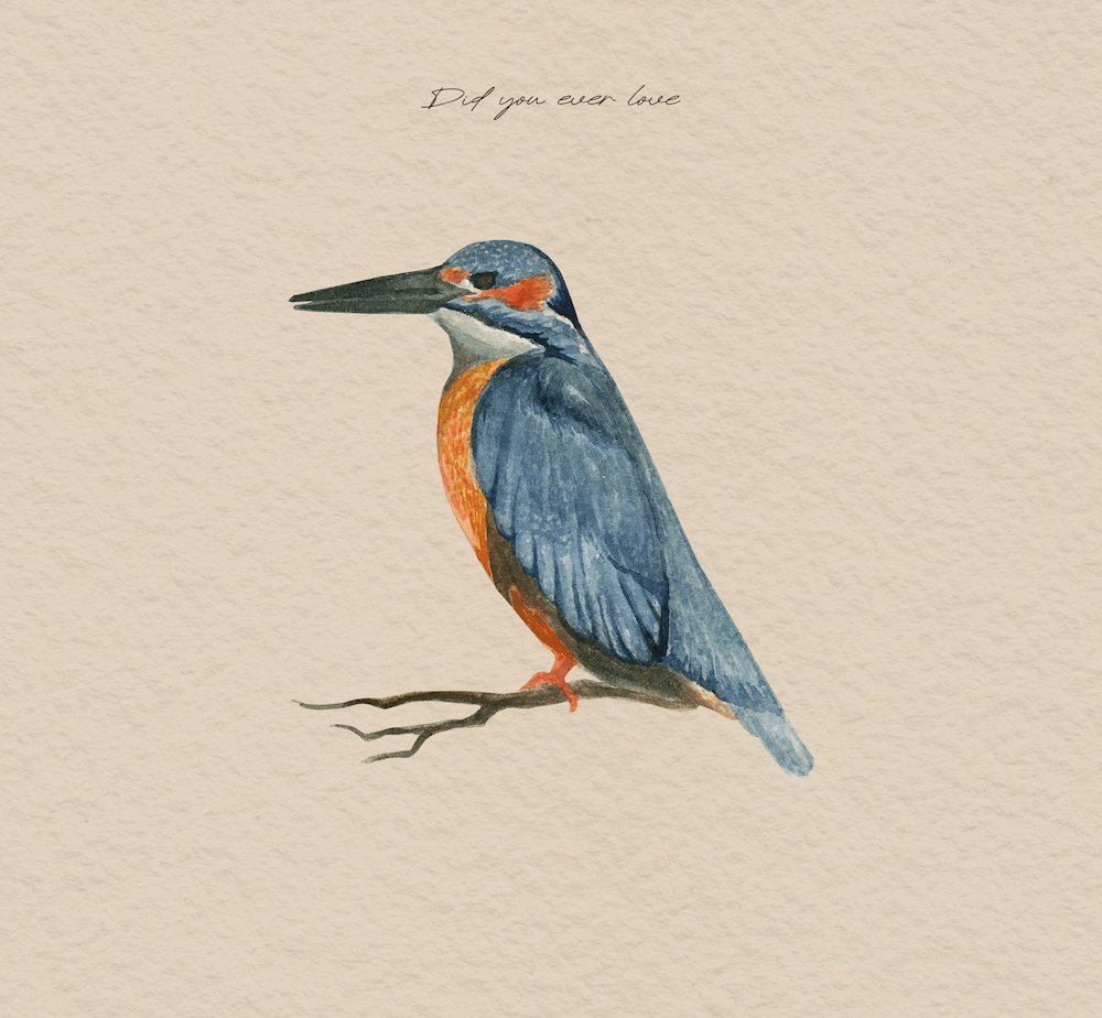
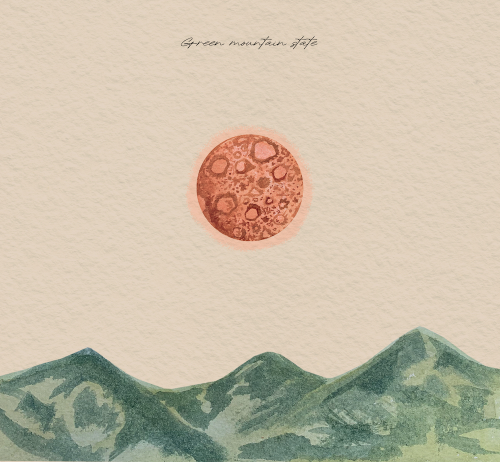
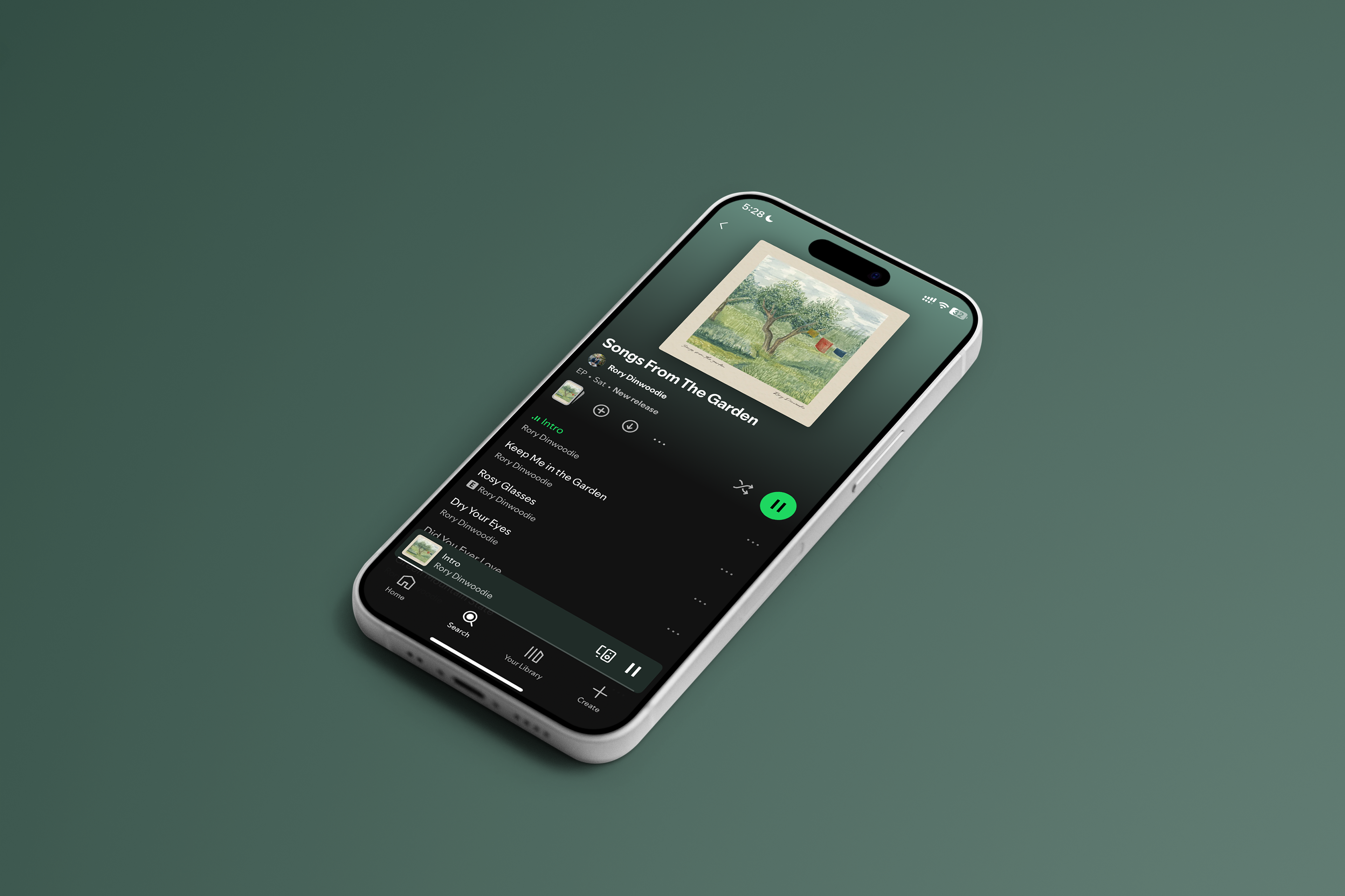
EP & Song Cover Art
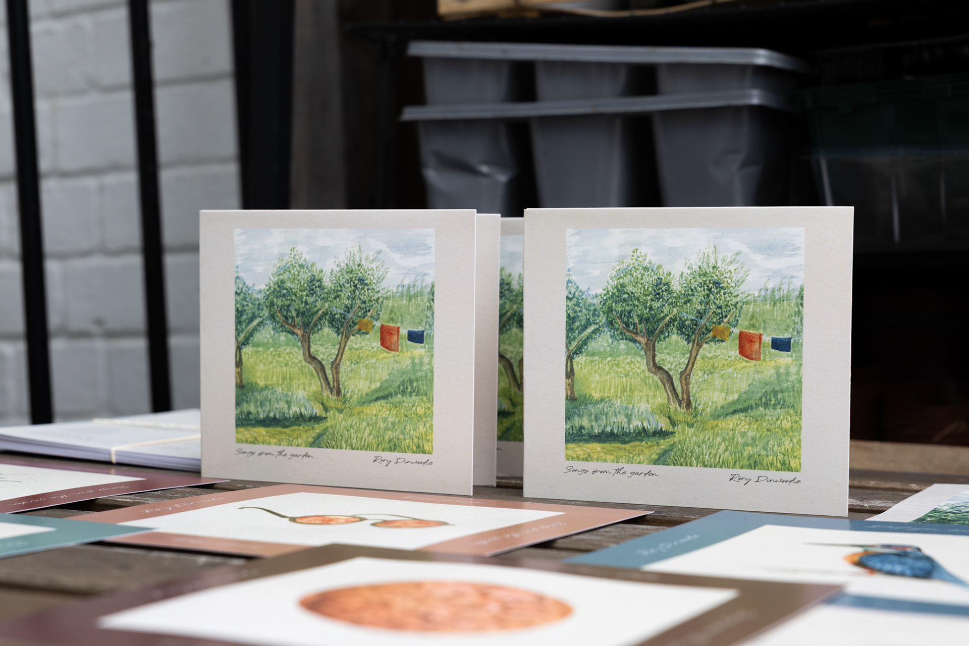
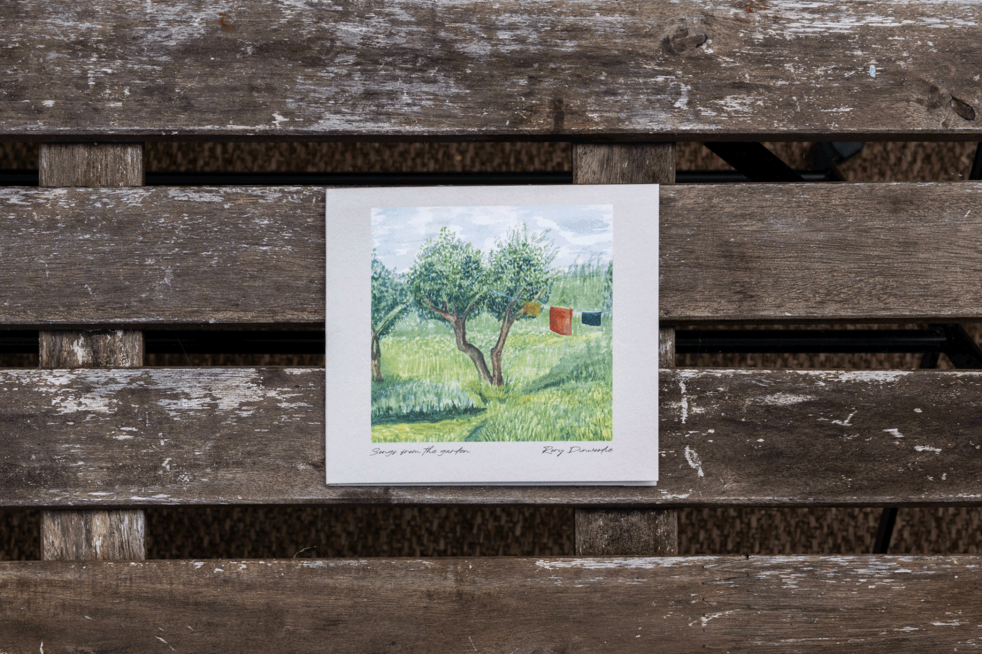
Developed from the original watercolor paintings, the final cover artworks combine handcrafted illustration with a consistent digital design system. The individual song covers were designed to stand alone while remaining visually connected to the EP as a whole, creating a cohesive presence across streaming platforms.
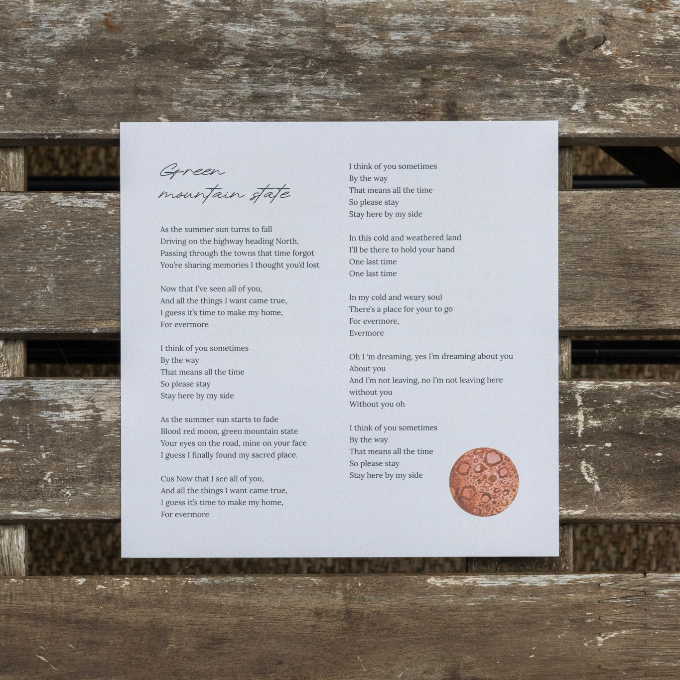
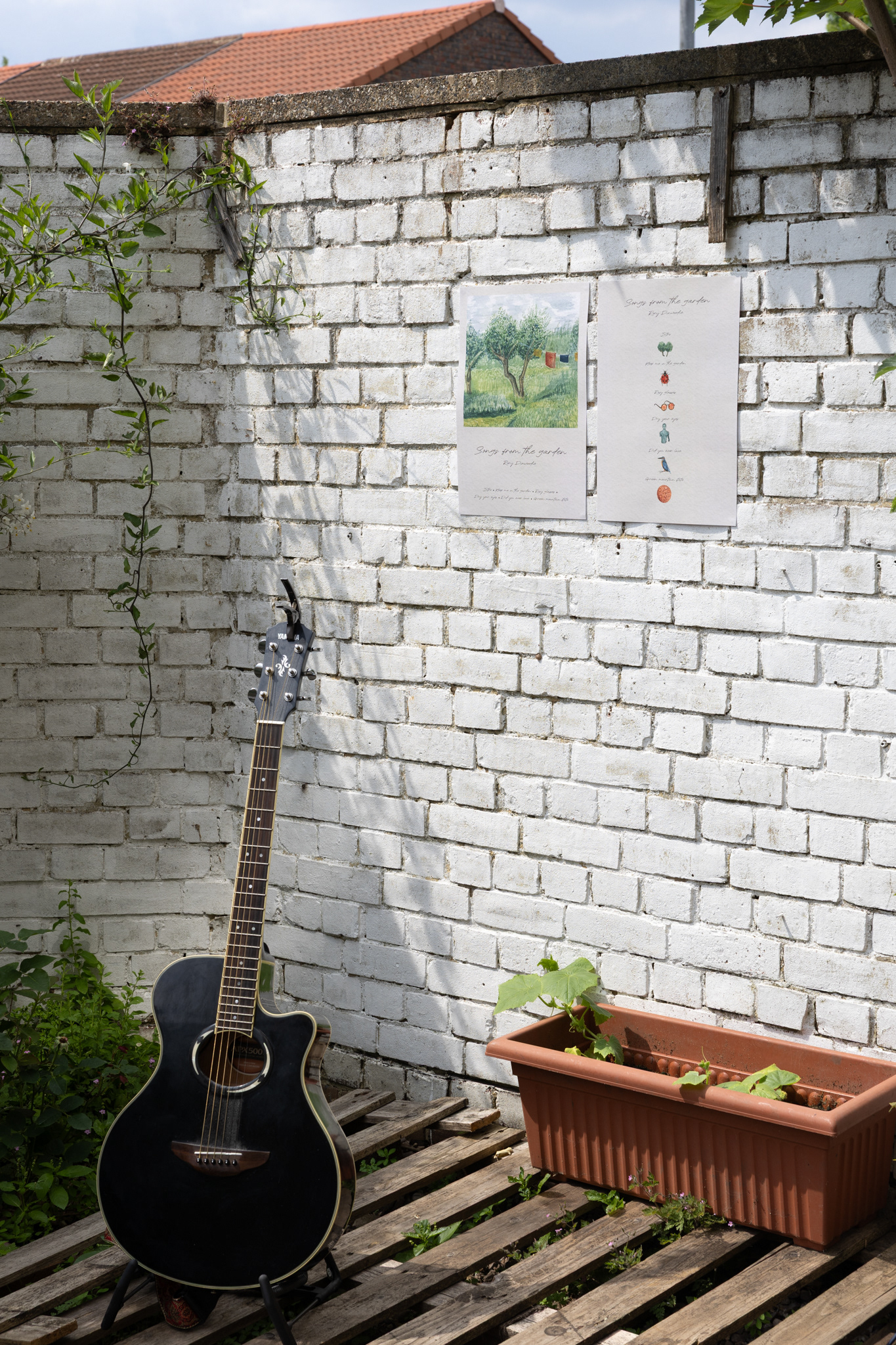
Release Materials
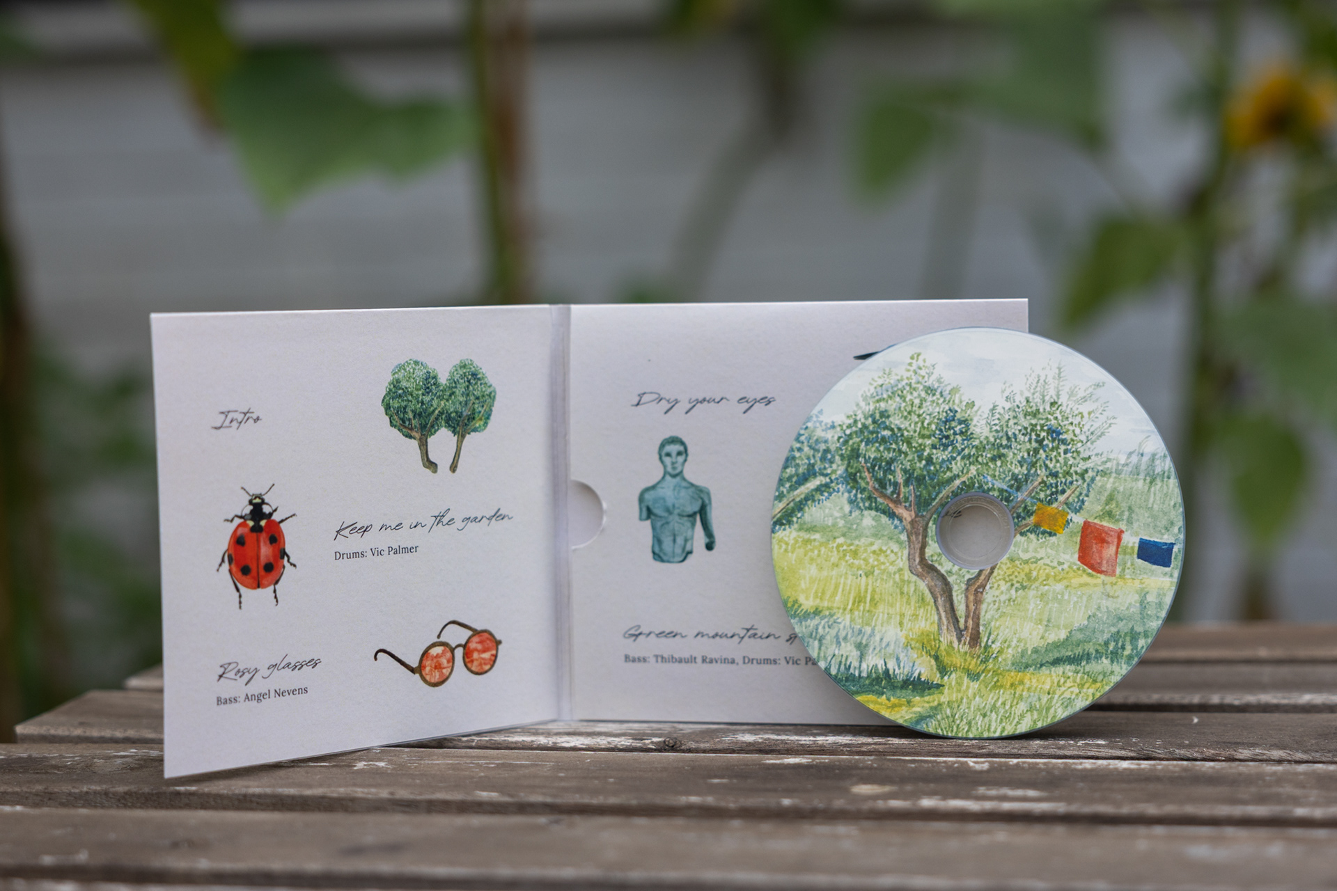
Building on the EP and song cover artwork, the visual identity was adapted across a range of physical and promotional materials, including CD packaging, lyric cards, and posters. Displayed and distributed at the EP release party, these pieces created a cohesive experience that connected the music, artwork, and audience.