Entitled to Equality is a reporting project dedicated to the 50th anniversary of the passage of Title IX. This project aims to identify how the legislation has advanced gender equality in the US since it was enacted in 1972. The project involves 85 student contributors and is comprised of a collection of 18 stories. As the design director, I developed the brand identity, social media graphics, and website.
Roles: Design Director, Web Designer
Client: The Newshouse
Ideation
Tasked to design the brand identity for the project, I started by sketching logo drafts based on the initial name ideas for the project: Cracking the Ceiling and Entitled to Equality.
I began by identifying the tone and message I wanted to communicate through the branding.
Visual Voice Words:
•Impactful
•Trustworthy
•Historical
•Noteworthy
Logo Design
Logomark
Wordmark
Full Horizontal Logo
Logo Animation
I also designed a logo animation in After Effects to add a dynamic element to the branding for video stories on the web and social graphics.
Styleguide
After creating the final logo form, I developed the rest of the branding. I incorporated a theme of contrast throughout the branding system to resonate with the content of the project. Between the contrasting experiences of men and women, the contrast in Title IX regulations now and 50 years ago, and the contrasting viewpoints on Title IX, this motif is carried throughout the reporting project.
Color
I selected a bright and punchy red and a complimentary muted mint color as the primary branding colors to create visual appeal and speak to the pink and blue typically used to represent gender.
Typography
For the type, I paired a bold all-caps sans serif header with a more delicate serif. The serif also aims to bring a sense of credibility since printed newspapers typically use serif typefaces.
Web Design
I began by identifying a number of design problems I looked to solve through the site design:
• How can we communicate the breadth of Title IX’s impact?
• How can we preserve a serious tone while incorporating visually experimental design elements?
• In what ways can we improve storytelling through website design?
• How can we reimagine the format of past projects to make a lasting impact on audiences?
Site Map
To begin addressing these design problems, I created a rough site map to figure out how I wanted users to navigate through the project. To draw audiences in and provide context, I was determined to create a highly visual landing page that would capture the breadth of the content. This landing page would provide a window into the project and link to the three main categories which would house the stories.
Landing Page
Using a video background and a clear call to action, I aimed to showcase the breadth of the project and provide context to the user before reading any of the stories. The video clips were shot and edited by students and professors involved in the project who worked closely with story subjects and attended sporting events.
Landing Page
Category Page
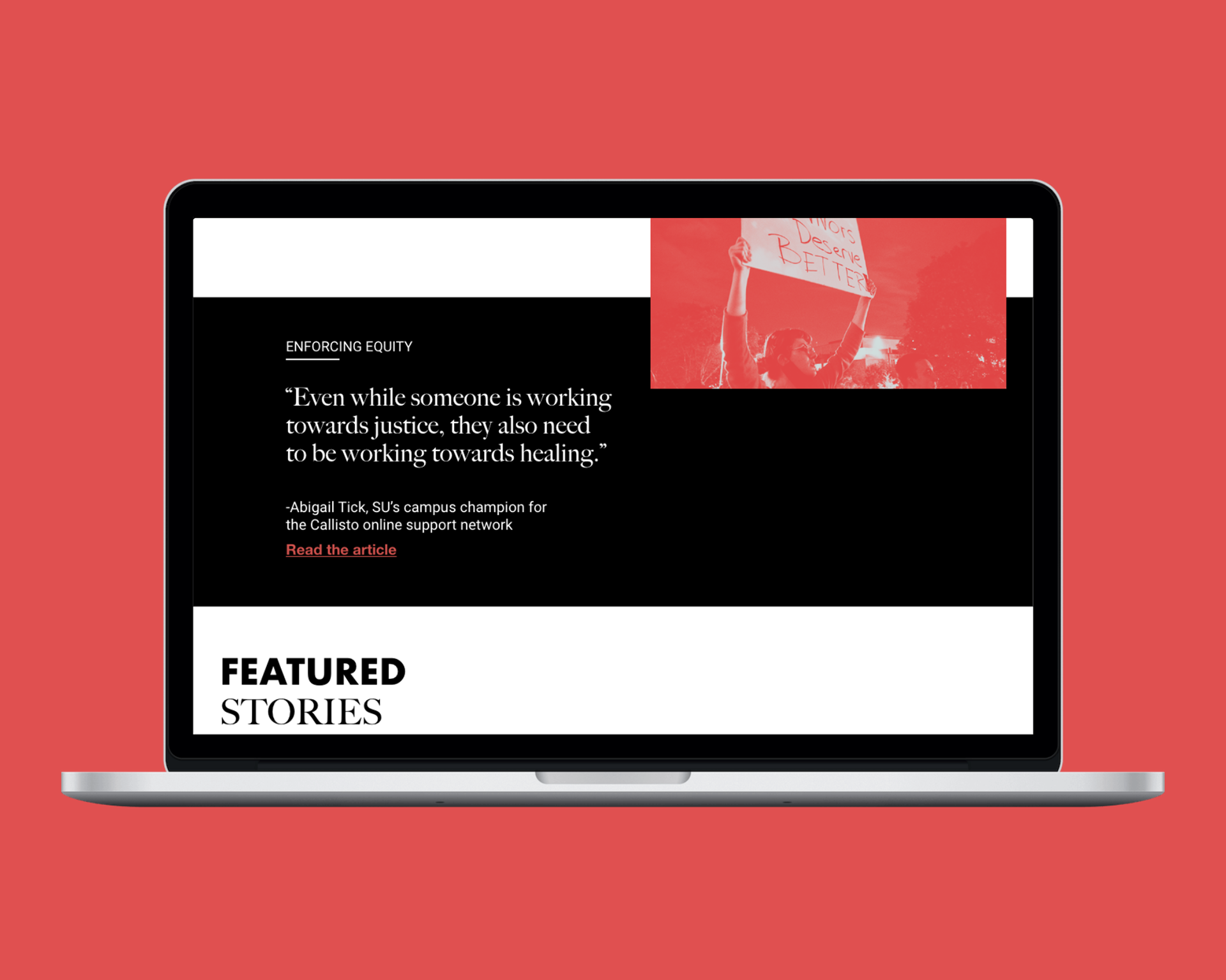
Category Page
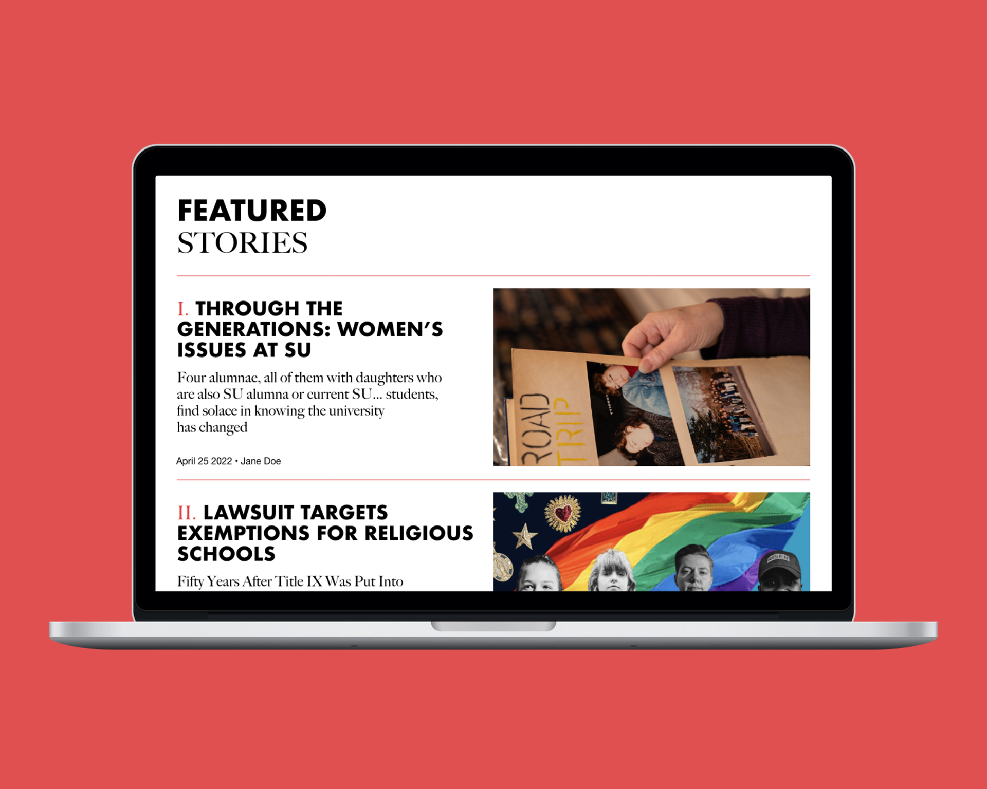
Category Page

Category Page
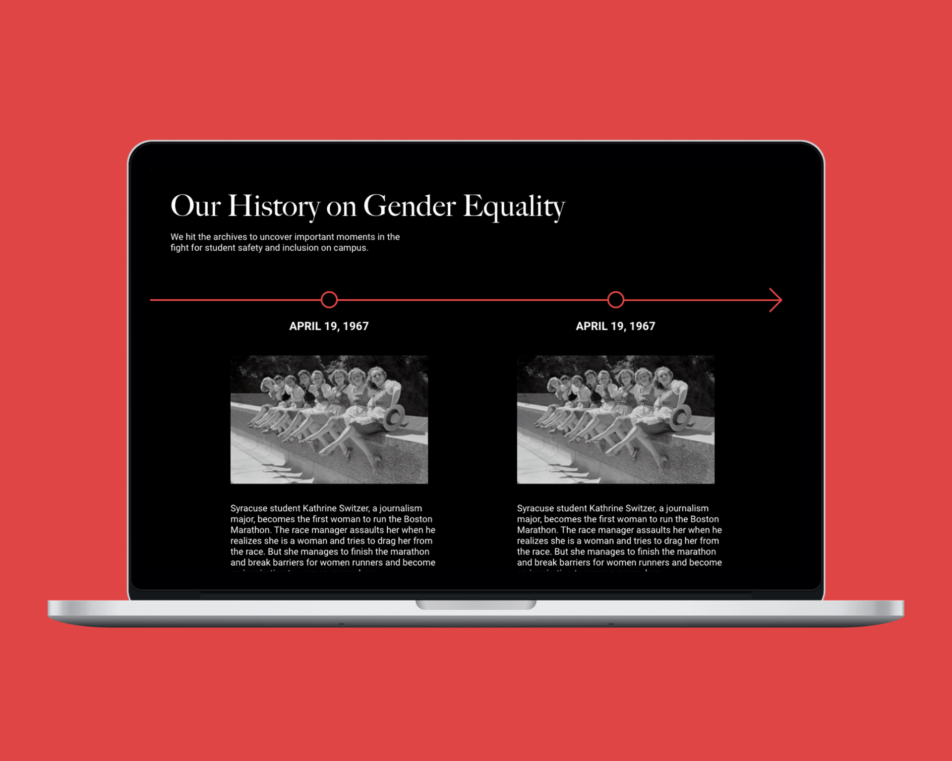
Category Page

Story Page
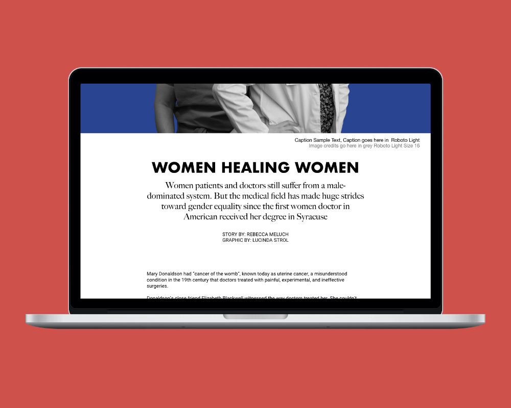
Story Page
Mobile Design
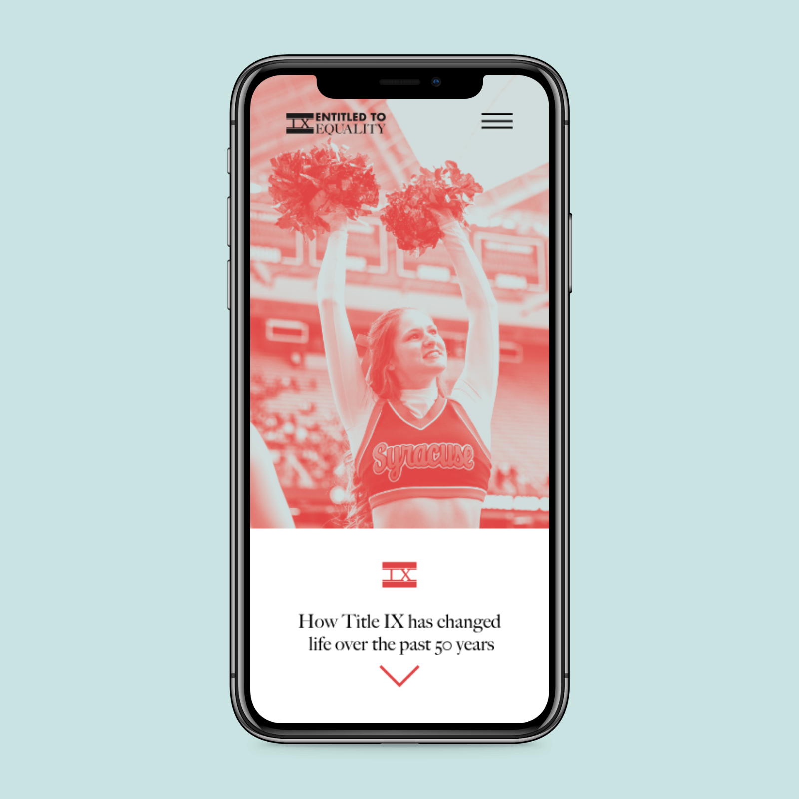
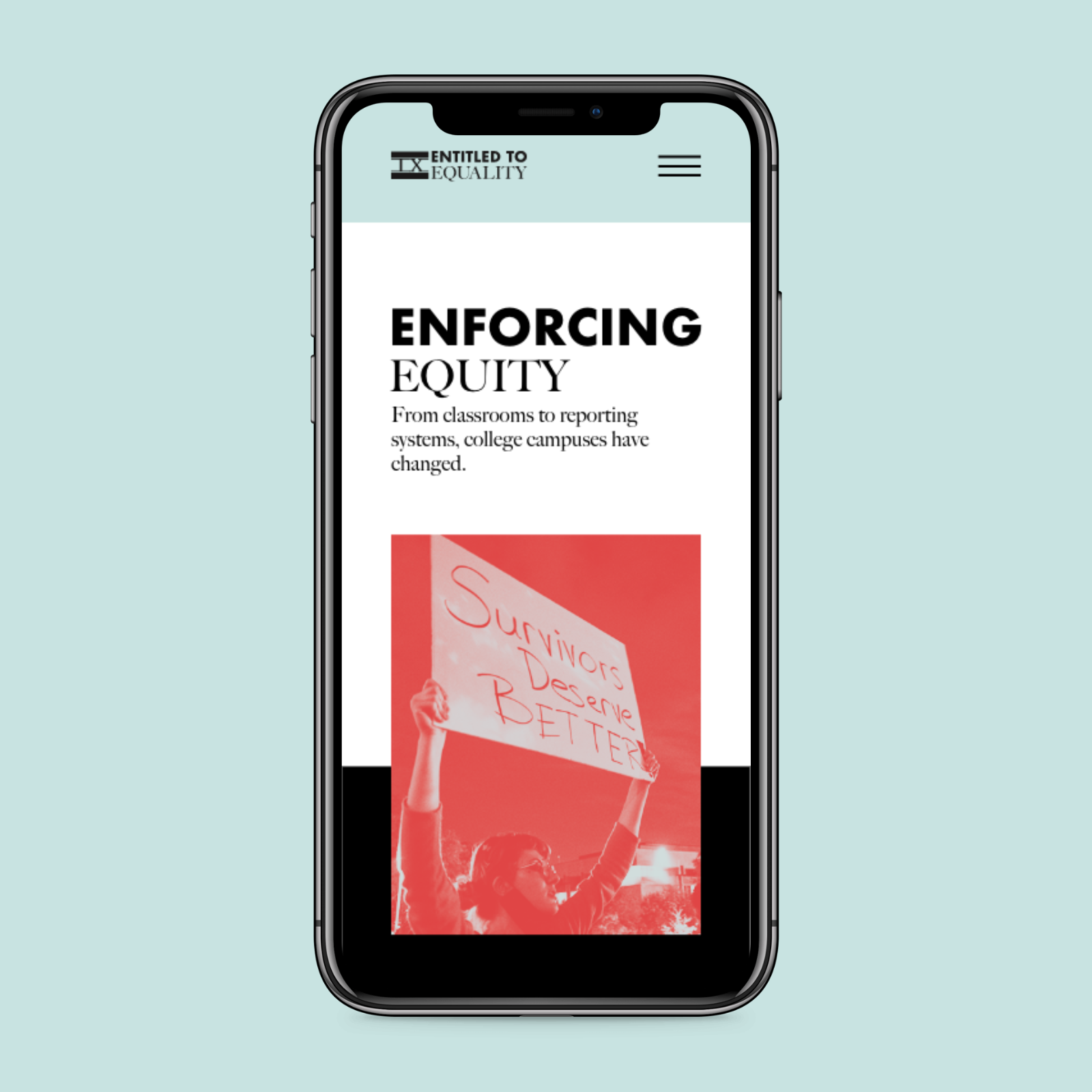
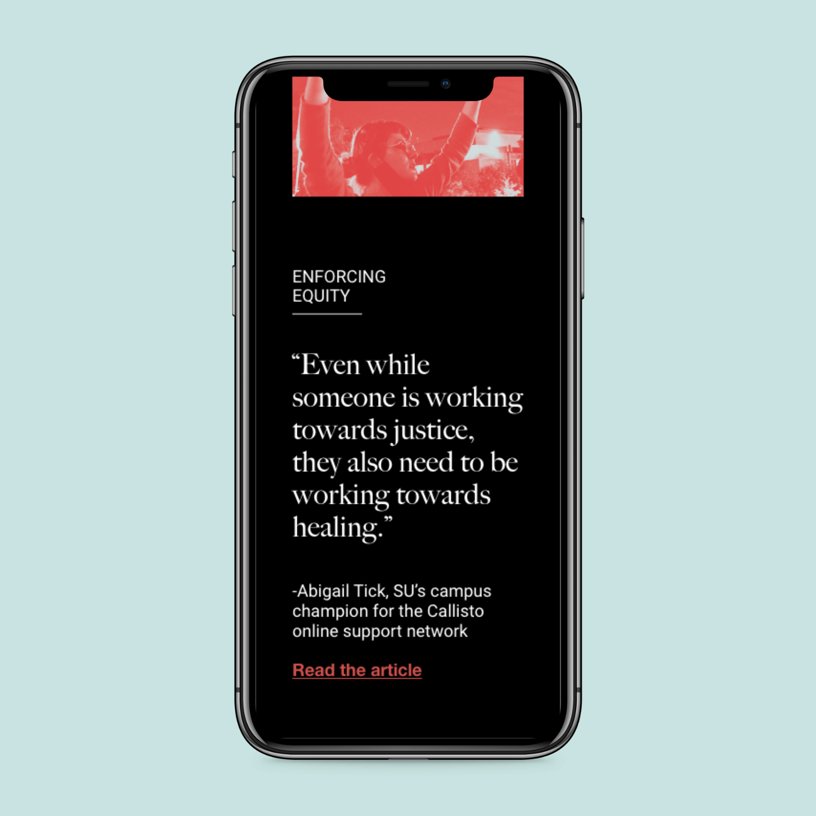
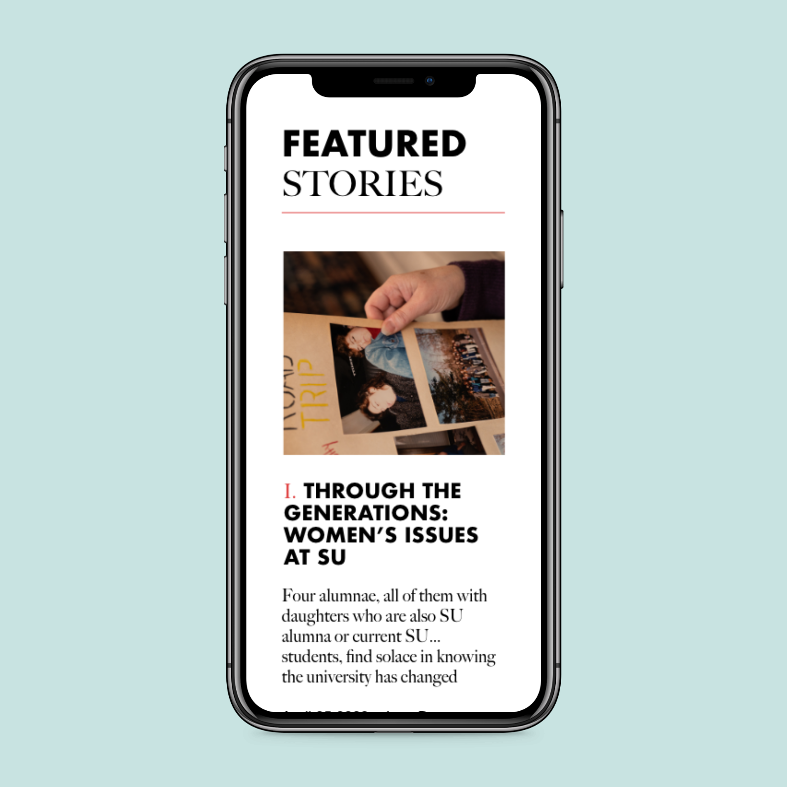


Social Graphics
Stickers